 Football has produced numerous fashion disasters both on and off the pitch.
Djibril Cisse’s Klub 9 label is the epitome of this off the pitch, specialising in tight sleeveless tops and generic faded logos.
On the pitch it’s hard to find the biggest sinner, but with each new season everyone has a go at outdoing each other with arbitrary colour schemes, unnecessarily large club badges and sponsors, more stripes than you can find on a herd of zebras and crap collars.
If footballers weren’t the modern day deities that they are, you might even be persuaded to think that the people working for Nike or some other sportswear designer have a vendetta against footballers and are just trying to make them look like numpties for the next nine months.
So with no further ado, here’s a rundown of this season’s worst football kits.
Most Unprofessional
Milwall are in a world of their own as far as looking like a pub team goes.
The high neck reeks of cheap manufacturing, while the huge lion was clearly a result of the designer losing his diary and only finding it a day before the new kits were due to be showcased.
The stripes on the away kit only add to this unprofessional look, although the choice of model doesn’t exactly flatter to deceive.
Most Pandering
Chelsea’s third kit seems to be nothing but an attempt to climb into the pants of EA Sports.
It’s as if they think that by making EA’s life easier in putting together Fifa 10, the actual Chelsea team’s stats might be made a little better and someone somewhere might start to think they’re potential Premiership champions.
This shirt is so computer generated that it even makes John Terry’s heart and passion for his club look genuine.
Most Retro/Pathetic
West Ham fans blow so many bubbles that they’ve ended up living in one in which cockney rhyming slang is a real language and they’re all a bunch of East End hard nut gangsters.
Ray Winstone’s modelling of their new home kit is a pathetic attempt to further these two myths, and the 1980s chequered look is another attempt at the same.
Most Likely to be Found on a Supermarket Shelf
This is a three way tie between Plymouth Argyle, Reading's away kit and Mexican side Club América.
Plymouth’s giant Ginsters logo makes the strip look like a massive pasty wrapper, while Reading’s oversized white and green Waitrose sponsored number looks more like a plastic bag than a football shirt.
Club América are renowned for using the same style for the home and away shirts. Tragically, this year that makes them look like giant sweets.
Best Innovation
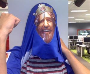
Getafe win this hands down, and not for having a huge Burger King logo on the front.
Someone somewhere has been thinking outside the box you see, so far outside the box in fact that they’ve practically smashed the idea of the box into oblivion.
What they’ve done is print a head with a Burger King crown on the inside of the shirt. This means that if a Getafe player wishes to celebrate a goal by lifting his shirt over his head the Burger King head appears to be the player’s head (see picture above).
Genius is a much overused word that I don’t like to throw around willy nilly, but in this instance I think it’s more than fair to use it. Genius.
Most Vomit-inducing
Someone gave a blind man free access to a paint warehouse at Real Valladoid. They then gave him three white shirts and asked him to daub all over them randomly, then threw away what he made and produced something ten times worse themselves.
These kits are nothing less than disgraceful. Anyone who willingly pays €65 for one should be smashed round the face and told that €65 is enough to provide 65 African kids with malaria treatment.
Least New
Aston Villa are a boring bunch of brummies at the best of times, but releasing a new kit that is exactly the same as last season’s kit apart from the neck is: 1. Piss poor. 2. A rip off for the fans. 3. Piss poor.
If you have any more suggestions for this season’s worst football kits, please post them on our social media channels.
